WRITING ABOUT GRAPHS AND TABLES
Very often information is shown as in a way that we can see instead of read, which call using “graphics.” Graphics may be drawings or pictures. They could also be in the form of a table or graph. These are typical ways that people try to express information visually – in a way that can be seen. Graphs and charts are very useful, because they tell this information in a very simple way that is easy to see. However, because they are so simple, they do not explain the information very well, they simply show it to you. This is why it becomes important to be able to write well about graphics.
There are several times that you could use this. First, it is a part of many English tests such as IELTS and TOEFL. Also, in business and study, people often need to take information that is shown visually and explain it more completely in writing. In other jobs, you may have to create graphs and tables, so understanding how they represent information will help you to create them and use them better as well.
Video or Slide Version
Video (Same as slide presentation with me narrating)
Types of Graphics
We will look at four different types of graphics in this lesson. If you understand how each type of graphic is used to show information, you will be able to write about them much more clearly. The first one is called a line graph (Figure A), because it uses one line to show numbers becoming larger or smaller. Line graphs are useful for showing changes over time, so your writing should pay attention to these changes. In our example, we can see that the number of foreign students at this university kept getting larger from 1975 to 1985. This is called a “trend,” meaning a long period of time when the number go up, go down or stay the same. You may also notice that the number of foreign students changes very little from 1985 to 1995. This is also a trend. By showing the trends, you can write completely and clearly about information presented in a line graph.
Bar graphs (Figure B) are especially good for comparing two or more things. You can see in our example that we are comparing the amounts of money earned by college graduates with that earned by non-graduates in England. Therefore, we should probably compare these groups in our writing as well. We can see that college graduates earned more money than the non-graduates. We can also see the difference becomes larger and larger as each group gets older.
You can see that pie charts (Figure C) are often used to show how one thing is divided. In our example the one thing is a student’s money, and the pie chart shows how it is spent in different ways. Your writing about this pie chart would be similar to the bar graph – it is best to compare the different figures. It would probably be best to first tell the two largest areas (rent and food & study material), then tell the two lower areas (entertainment and clothes). Then you would compare the differences in these numbers and tell what reasons you think there are for these differences.
Tables (Figure D) can be very easy to understand, but sometimes difficult to write about. This is because the information is often less simple. You can see in the example, that we are looking at many different things; we are comparing men and women, but we are also comparing different smoking habits. This means that you want to compare both of these differences and show how they affect one another. For example, we can see that among people who smoke very much (more than twenty each day) it is the men who smoke the most. However, among people who smoke little (less than ten each day), there are more women who smoke. These are the types of things you need to notice and explain in your writing.
Five Steps For Writing About Graphics
To write well about graphics there are five basic steps, and we will use the line graph (Figure A) to show these. First, you should find the highest and the lowest numbers. The highest number on our chart about foreign students is 1,200 in 1995, and that the lowest number was under 200 in the year 2005. From the lowest to the highest is sometimes called the “range” of the numbers. The next thing you should do is to see if there are any things that are similar. From 1985 to 2000 we saw that the numbers changed very little. By explaining the differences, then the similarities, we have given reader a clear basic idea of the information.
Then, you should also find the things that seem to be very different from the other information, things that seem unusual. In our line graph, we can see that there is only one time when the numbers stayed the same – from 1985 to 1990. At all other times the numbers were either going up or down. Fourth, find any trends. In our example, we can see that from 1980 to 1985 the numbers went up very quickly. However, from 2000 to 2005 the numbers went down very quickly.
Finally, tell what the numbers mean. In many ways this last one is the most important for the writer, because our purpose in writing is to explain the chart’s information to the reader in a clear and complete way. For example, the graph seems to tell us that from 1975 to 1995, the school was very successful at getting students from other countries to attend their university. However, something happened after 1995 to make a very large change to this situation. You may tell the reader some possible reasons for this. Is it because the cost became too high for many students after 1995? Did it become harder for students to get visas to study abroad in the United States? Your ability to have ideas about the meaning of the numbers makes your writing tell more than the reader would learn simply looking at the chart or graph.
General Tips
Do not try to put every number from the graphic into your essay. If my writing is exactly the same as the graphic, then there is no reason to read my essay. The reader could simply look at the graph or chart. Your writing is supposed to be a summary of the information. You remember that means to express the main ideas in your own words, not to repeat everything.
Also, make sure you understand what is being shown on the graphic. If you look at the chart of men and women smokers, you can see that the numbers used are all per cent (%). This means we would not want to write, “Thirteen men smoke more than twenty cigarettes a day.” We would wish to tell the reader, “Thirteen percent of men who smoke, smoke more than twenty cigarettes a day.”
Be careful not to add information that is not given on the graphic. For example, we might feel that many of students in Figure C get some help from their parents in buying study materials, so that the money they spend is larger than 25% of their own income. However, we can not tell the reader that this is true, because it is only our guess. The pie chart does not actually tell us. It is very good to put some of these guesses into your paper, simply make sure that you clearly tell the reader that these are only your opinion.
Also, do not copy too many words from the graphic, especially words you may not understand. If you do not understand a word, it is too easy to use it incorrectly in your writing. Even if you use the words correctly, remember that your job is to summarize, meaning to use your own way of expressing. Your ability to take information expressed in one way and change that to your own way of expressing is what shows that you understood the information, it makes your writing better.
Finally, you may use either the present tense or past tense to write about a graphic. However, you must use the same one throughout the whole essay. For example, looking at our pie chart about student spending, we may write:
Students spend most of their money on food and rent, and study materials. On things such as clothes and fun, they only spend 15% each.
Or we may write
Students spent most of their money on food and rent, and study materials. On things such as clothes and fun, they only spent 15% each.
However, we may not write:
Students spend most of their money on food and rent, and study materials. On things such as clothes and fun, they only spent 15% each.
Language– Common Terms for Describing Graphics
There are some words you can add to your vocabulary to help you very clearly express the ideas and information in a graphic. The first of these are vivid verbs which describe what the numbers or information are doing. Words which show numbers going down are decrease, drop, decline and fall. In Figure A these words describe the trend from 1990 to 2000. When the numbers get smaller very quickly, we use words such as plummet and dive. These would describe the numbers from 2000 to 2005. Therefore, we could write:
The number of foreign students decreased from 1995 to 2000, but plummeted from 2000 to 2005.
For numbers that are getting higher, we use the words rise and increase. This is what you see on the line graph from 1975 to 1980. However, if the numbers go up quickly, as they did from 1980 to 1985, we would use words such as soar or rocket. Here, we could write:
Foreign students at the school rose for five years after 1975, but soared after 1980.
If the numbers change very little, as they do from 1985 to 1990, we would say that they level out. The highest number given in a graphic can be called its peak. In our line graph, we can see that the peak is at 1985, when the numbers reached 1,200. When the numbers go very low, but then rise again later, we can call this a dip, which we can see between 1985 and 1990. Therefore, we could describe the information this way:
The number of foreign students soared from 1980 to 1985, when they reached their peak of 1,200. Then they dipped to 800 between 1985 and 1990. Then they rose again to 1,200 and leveled out until 1995.
You may have noticed that in this passage, the word “dip” was used as a verb. This is true for much of the vocabulary taught here. For example, we could have written, “The numbers peaked at 1,200,” Just the words “plummet” and “soar” can be used only as verbs.
To describe the verbs, there are certain common adverbs as well. When numbers go up or down slowly over time, we would use terms such as slightly, steadily, or gradually. If they rise or fall very quickly, this could be described as sharply, rapidly or drastically. We could write about our line chart in this way:
The number of students declined steadily from 1995 to 2000, but then plummeted drastically from 2000 to 2005.
If you look at the year 2005 in the line graph, you can see that the number is not exactly at 200 or 100. When we have these kinds of numbers, we should avoid using words such as “around” or “about” to describe this. We would not write, “In 2005, the number of students was about 100.” This does not work very well, because it is not specific enough. “Around” could be either higher or lower than one-hundred– the reader can not tell. For this reason, it is best to use phrases such as “just under” or “just over,” to give the reader a clearer, more specific understanding. “The number of foreign students was just under 100,” is a better way to express this, because now the reader knows more.
Figure A: Line Graph
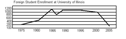
Figure B: Bar Graph
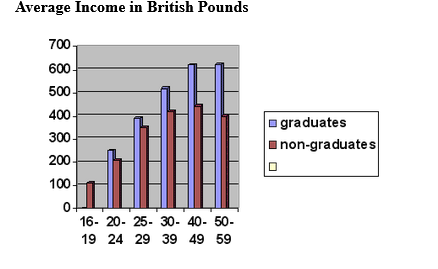
Figure C: Pie Chart
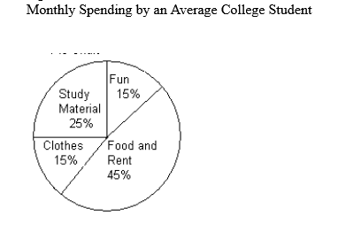
Figure D: Table
Cigarette Smoking by gender %
| men | women | |
| 20+ a day | 13 | 9 |
| 10-19 a day | 11 | 10 |
| less than 10 a day | 7 | 10 |
| quit | 30 | 24 |
| never smoked | 39 | 47 |
