Now that you are familiar with some basic demographic concepts, we can discuss population growth and decline in more detail. Three of the factors just discussed determine changes in population size: fertility (crude birth rate), mortality (crude death rate), and net migration. The (RNI) is simply the difference between the crude birth rate and the crude death rate. The U.S. birth rate is 11 per 1,000 while the death rate is 10 per 1,000 people, thus the rate of natural increase is currently 1 per 1,000 people per year or .1% (Rosenberg, 2009; Population Reference Bureau, 2021). The current rate of net migration in the U.S. is 1 per 1,000 people and when the rate of net migration is considered along with the rate of natural increase, the total annual population growth rate in the U.S. is currently .2% per year (Population Reference Bureau, 2021). Meaning, for every 1,000 people in the U.S. population, 2 more people, through birth or immigration, will be added this year.
.
|
Think Like a Sociologist |
|
The world population is currently almost 8 billion people and growing. Click on the links below to check out these informative websites showing change in the world population and demonstrating the pace of growth over time. U.S. Census Bureau Population Clock WorldOMeters World Population Clock Upon looking at the population clocks for the U.S. and world, what do you observe? What is your reaction to these observations? In the U.S. Census Bureau Population Clock site, scroll down to the interactive world map. Click on 1-2 countries per world region (Africa, Asia, Europe, North America, South America). For each country you’ve clicked on, examine the information and find the “Current and Projected Population” chart. These charts show the current population size for each country as well as the projected population for the year 2060. What differences do you notice in the projected change in population size when comparing countries from different world regions? In the WorldOMeters World Population Clock site, take a look at the “World Population: Past, Present, and Future” graph and the “World Population Forecast” table. What observations did you make regarding how the world population has grown over time, and what is the projection for future population growth (i.e., what do demographers predict the world population will be in 2050)? |
.
Population Growth
Figure 8.9 “Annual Population Growth Rate (%), 2020” depicts the annual population growth rates (including both rates of natural increase and net migration) for all nations of the world. Note that several African nations are seeing population growth rates of at least 3-4% per year or more, while most European nations are growing by less than 1% or are even losing population. Overall, the world population is growing by over 80 million people annually.
Figure 8.9 Annual Population Growth Rate (%), 2020

Data Source: World Bank, DataBank, World Development Indicators. Data extracted on 12-12-2021. https://databank.worldbank.org/reports.aspx?source=2&series=SP.POP.GROW&country=#
In addition to the annual population growth rate, is also a calculation that demographers use to understand how rapidly or slowly a country’s population is growing. To determine how long it takes for a nation to double its population size, you divide the number 70 by its annual population growth rate. For example, if a nation has an annual population growth rate of 3%, it takes about 23 years (70 ÷ 3 = 23) for that nation’s population to double. As you can see from the map Figure 8.9 “Annual Population Growth Rate (%), 2020” above, several nations in sub-Saharan Africa will see their population size double in this time span or less if their annual growth continues at its present rate. For these nations, population growth will be a serious problem if food and other resources are not adequate or equitably distributed.
.
|
Think Like a Sociologist |
||||||||||||||||||||||||
|
Using the formula above, calculate the population doubling time for the following countries based on their annual growth rates:
What is the range in doubling time? What are potential issues that each of these countries may face given their doubling time data? There are a number of countries in Eastern Europe, which, like Japan, have negative annual growth rates. This means their populations are shrinking. For instance, Bulgaria has a -.7 annual growth rate, which means its doubling time is -100. Otherwise stated, at current rates, within 100 years, Bulgaria’s population will shrink by half.
|
.
Demographers use their knowledge of fertility, mortality, and migration trends to make predictions about population growth and decline several decades into the future. Coupled with our knowledge of past population sizes, these projections allow us to understand population trends over many generations. One clear pattern emerges from the study of population growth. In the earliest forms of society, when societies were small, population growth was slow because there were relatively few adults to procreate. Also, death rates were high, which helped to neutralize high fertility rates within these societies. Lastly, fertility rates were typically lower in foraging groups due to lower calorie diets coupled with active lifestyles, which reduced women’s reproductive capacity. But, as calories increased and the number of people grew over time, so did the number of adults. More and more reproduction thus occurred every single generation, and eventually population growth soared.
We see evidence of this pattern when we look at world population growth. When agricultural societies developed some 12,000 years ago, only about 8 million people occupied the planet (which is less than Michigan’s population of 10 million today). This number reached about 300 million about 2,100 years ago, and by the 15th century it was still only about 500 million. Global population finally reached 1 billion in 1804 and by 1927, only 123 years later, had doubled to 2 billion. The world population is projected to reach 8 billion by 2023, so in less than 100 years, from 1927 to 2023, the human population will quadrupled. Currently, the global population is projected to reach more than 9.7 billion by 2050 (United Nations, 2019).
In 2020, the world annual population growth rate was 1.036, with a doubling time (if current growth rates were to persist) of 68 years. However, as shown in Figure 8.10 “Global Annual Population Growth Rates, 1963 – 2020,” the global rate of population growth has been on the decline for decades. So, even though the global population is still growing and is expected to continue to grow, this growth is slowing and is expected to peak in 2100 at 11 billion (United Nations, 2019).
Figure 8.10 Global Annual Population Growth Rates, 1963 – 2020

Data Source: World Bank, DataBank, Microdata Data Catalog. Data extracted on 12-12-2021. https://data.worldbank.org/indicator/sp.pop.grow
As discussed above, the highest population growth rates in the world today are primarily in sub-Saharan Africa and south Asia. The growth that does occur will be concentrated in these regions, where we find most of the poorest nations. Still, even there the average number of children a woman has in her lifetime dropped from six a generation ago to about three today (a very rapid decrease within one generation). While population is growing in these regions, similar to the global population trends, the rate of population growth is slowing.
.
|
Watch and Reflect |
|
After watching the video above, consider the following questions: According to Hans Rosling, what is the key factor in slowing and eventually stopping global population growth? What is Rosling’s projection for the eventual size of the world population? What are your thoughts about this number? |
.
Theories of Population Growth
The numbers just discussed show that the size of the world population has increased tremendously in just a few centuries. Not surprisingly, people have worried about population growth and specifically overpopulation at least since the 18th century. One of the first to warn about population growth was Thomas Malthus (1766–1834), an English economist, who said that population increases geometrically (2, 4, 8, 16, 32, 64, 128, 256, 512, 1024…). If you expand this list of numbers, you will see that they soon become overwhelmingly large in just a few more generations. In contrast, Malthus (1798/1926) said that food production increases only arithmetically (1, 2, 3, 4, 5, 6…) and thus could not hope to keep up with the population increase, and he predicted that mass starvation would be the dire result. This theory is referred to as the .

Thomas Malthus, an English economist, wrote that population increases geometrically while food production increases only arithmetically. These understandings led him to predict mass starvation. Wikimedia Commons – public domain.
During the 1970s, concern about population growth increased again, leading to a call by some activists for (ZPG). There was much concern over the rapidly growing population in the United States and around the world, and there was fear that our “small planet” could not support massive increases in the number of people (Ehrlich, 1969). Some of the direst predictions of the time warned of serious food shortages by the end of the century.
Fortunately, Malthus and ZPG advocates were wrong to some degree. Although population levels have certainly increased, the projections, as we’ve discussed, show that the rate of increase is slowing. Among other factors, the development of more effective contraception, especially the birth control pill, has limited population growth in the industrial and post-industrial nations and, increasingly, in lower-income nations. Food production has also increased by a much greater amount than Malthus and ZPG advocates predicted. Concern about overpopulation has weakened, as the world’s resources seem to be standing up to population growth. Widespread hunger in Africa and other regions does exist, with hundreds of millions of people suffering from hunger and malnutrition, but many experts attribute this problem not to overpopulation and lack of food but rather to problems in equitable distribution of the sufficient amount of food that exists.
Another factor might have played a role in weakening advocacy for ZPG: criticism by people of color that ZPG was directed largely at their ranks and smacked of racism. The call for population control, they said, was a disguised call for controlling the growth of their own populations and thus reducing their influence (Kuumba, 1993).
Demographic Transition Theory
An alternative theory on population growth subscribed to by most sociologists is the . This theory links population growth to the level of technological development across 5 stages of social evolution. As seen below in Figure 8.11 “Demographic Transition Theory Visualization,” In the first stage, coinciding with preindustrial societies, birth rate and death rate are both high. The birth rate is high because of the lack of contraception and the several other reasons cited earlier for high fertility rates, and the death rate is high because of disease, poor nutrition, lack of modern medicine, and other problems. These two high rates cancel each other out, and little population growth occurs.
In the second stage, coinciding with the development of early industrial societies, the birth rate remains fairly high, owing to the lack of contraception and a continuing belief in the value of large families, but the death rate drops because of several factors, including increased food production, better sanitation, and improved medicine. Because the birth rate remains high, but the death rate drops, population growth takes off dramatically.
Figure 8.11 Demographic Transition Theory Visualization
Max Roser – CC BY-SA 4.0 – via Wikimedia Commons
In the third stage, as industrial societies mature, the death rate remains low, and the birth rate finally drops as families begin to realize that large numbers of children in an industrial economy are more of a burden than an asset. Another reason for the drop is the availability of effective contraception. As a result, population growth slows, and, as we saw earlier, it has become quite low or even gone into a decline in numerous mature industrial middle-income nations.
The fourth and fifth stages of the demographic transition occur in post-industrial societies, where the birth rate falls to low levels on par with death rates, and in some cases, as shown in Stage 5, nations begin to experience natural decrease in their populations as birth rates fall below death rates. Demographic transition theory, then, gives us more reason to be cautiously optimistic regarding the concerns associated with overpopulation: as poor nations industrialize, their population growth rates should start to decline.
.
|
Watch and Reflect |
|
Here is another video by Hans Rosling, in which he examines global population growth and economic inequality. Watch the video and reflect on the questions below. Are the ideas presented by Hans Rosling aligned with the Malthusian Theory or the Demographic Transition Theory? Why do you think this? Which theory do you think is most accurate? Explain. What are Rosling’s predictions for the future in terms of population growth and global economic distribution? |
.
Population Decline and Pronatalism
Still another reason for the reduced concern over population growth is that birth rates in many post-industrial nations have slowed considerably. Some nations are even experiencing population declines, while many more are projected to have population declines by 2050 (Goldstein, Sobotka, & Jasilioniene, 2009). As discussed, for a country to maintain its population, the average woman needs to have 2.1 children (not accounting for immigration). Post-industrial nations, as well as many industrial nations, are far below this level. Increased birth control is one reason for their lower fertility rates but so are decisions by women to stay in school longer, to go to work right after their schooling ends, and to not have their first child until somewhat later.
Ironically, these nations’ population declines have begun to concern demographers and policymakers (Shorto, 2008). Because people in many industrial nations are living longer while the birth rate drops, these nations are increasingly having a greater proportion of older people and a smaller proportion of younger people. As this trend continues, it will become increasingly difficult to take care of the health and income needs of so many older persons, and there may be too few younger people to fill the many jobs and provide the many services that post-industrial society demands. The smaller labor force may also mean that governments will have fewer income tax dollars to provide these services.
To deal with these problems, some governments have initiated aimed at encouraging women to have more children. In particular, they provide generous child-care subsidies, tax incentives, and flexible work schedules designed to make it easier to bear and raise children, and some even provide couples cash payments when they have an additional child. For example, Russia in some cases provides the equivalent of about $9,000 for each child beyond the first, while Spain provides 2500 Euros (equivalent to about $3,400) for each child (Haub, 2009). In addition, some countries, such as Japan, strive to automate industrial and service sector jobs, helping to ensure their economy stays strong in the face of a shrinking workforce.

In addition to pronatalist policies, countries with stagnating or declining populations may also automate industries in order to reduce the need for labor. In 2020, Japan had over 4 million vending machines, which is roughly 1 vending machine per every 31 people. Kristoffer Brink Jonsson – Pexels
.
|
Think Like a Sociologist |
|
As discussed above, pronatalist economic policies and automation are two solutions to cope with a declining population. Can you think of any other solutions to resolve the challenges associated with a declining and aging population? What are the pros and cons of these solutions? |
.
Population Pyramids
As discussed, fertility, mortality, and migration rates are used to examine the current state and future projections for a given population. In addition to these figures, the study of population also includes review of the age and sex composition of societies. In fact, the changes outlined in the demographic transition theory are also reflected in the age and sex composition of societies. Parallel to Figure 8.11 “Demographic Transition Theory Visualization” we can lay out and compare age-sex graphs (known as ) to better understand the demographic transitions that societies undergo. As demonstrated below in Figure 8.12 “Population Pyramid, India, 2021,” population pyramids graphically represent the population of a society by sex, in 5-year age increments.
Figure 8.12 Population Pyramid, India, 2021

Source: Census.gov, International Program Main Data, International Data Base. Data extracted on 12-12-2021. https://www.census.gov/data-tools/demo/idb/#/pop?menu=popViz&FIPS=IN
Population pyramids depict the male portion of a society on the left (in blue) and the female portion of a society on the right (in pink). Each horizontal bar represents a 5-year age group. At the base are people ages 0-4, the next horizontal bar are people ages 5-9 and so on up the chart until you get to people who are 100+ years old. Looking at the example of India, this means that there are roughly 59.9 million boys aged 0 – 4, and 53.6 million girls in this same age group. While it is natural for more males to be born than females, the gap of 6.3 million more boys than girls in the 0-4 age group in India is significant and demonstrates a preference for boy babies. Technologies such as amniocentesis and ultrasound can be used to determine fetal sex, prompting the decision to terminate a pregnancy if the fetus is found to be female. Another factor that stands out in India’s population pyramid is that in the last 25 years India’s population growth seems to have stabilized, with very similar numbers aged 0-4, through 20-24. As we will discuss below, this likely reflects India undergoing rapid industrialization.
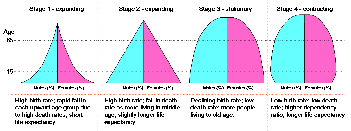
The shape of population pyramids parallels the stage of a country’s demographic transition, as shown below in Figure 8.13 “Population Pyramids and the Demographic Transition Theory.” A country in the first stage of the demographic transition, as discussed, will have both high birth and death rates, evidenced by a population pyramid with a wide base (lots of children due to a high birth rate) and concave sides, reflecting high rates of death in each age group. Such a shape would typically show that a country, having high birth and death rates, is pre-industrial. There are exceptions, though. Some countries that have been war-torn for prolonged periods of time may take on this shape as well, providing that they have a high birth rate.
Figure 8.13 Population Pyramids and the Demographic Transition Theory
SuzanneKn – Public domain – Wikimedia Commons
As a society starts to industrialize and transition to Stage 2 of the demographic transition, its population pyramid begins to change shape. It retains its wide base due to continued high fertility, but the shape becomes more an equilateral triangle, reflecting a declining death rate. Today, mostly low-income nations and some low-middle income nations take this shape. Figure 8.14 “Population Pyramid, Pakistan, 2021” demonstrates this shape.
Figure 8.14: Population Pyramid, Pakistan, 2021

Source: Census.gov, International Program Main Data, International Data Base. Data extracted on 12-12-2021. https://www.census.gov/data-tools/demo/idb/#/pop?menu=popViz&FIPS=IN
As we saw above with India’s population pyramid in Figure 8.12 “Population Pyramid, India, 2021,” population pyramids reflecting the third stage of the demographic transition begin to take on a haystack shape, reflecting low mortality and falling birth rates. This haystack shape shows fertility is reaching replacement level (in 2021, India’s Total Fertility Rate was 2.28), and that more people are living to old age.
Finally, the population pyramid for stages 4 and 5 of the demographic transition shows the similar haystack shape of stage 3, however, the pyramid narrows at the base indicating that birth and death rates are both low and that birth rate is starting to dip below death rate in some countries. This shape characterizes most high-income nations.
Figure 8.15: Population Pyramid, Italy, 2021

Source: Census.gov, International Program Main Data, International Data Base. Data extracted on 12-12-2021. fhttps://www.census.gov/data-tools/demo/idb/#/pop?menu=popViz&FIPS=IN
Italy’s population pyramid, shown above in Figure 8.15: “Population Pyramid, Italy, 2021” demonstrates the last stage of the demographic transition, with each successive age cohort in the last 50 years smaller than the one before. Two other things stand out in Italy’s population pyramid in addition to the overall shape. Looking at the top of the population pyramid for Italy, you may note that there are many more females than males. In fact, in the 85-89-year-old age cohort, only 37% are male. Even more skewed, 31.6% are male in the 90-94 years old age cohort. This sex ratio imbalance reflects the fact that females, on average, live longer than males. Also, these are the age cohorts that would have been directly involved in World War II as either civilians or soldiers. The smaller number of elderly men, in part, reflects their involvement as soldiers in the war. Another related observation that can be made about Italy’s pyramid is the baby boom bulge in the middle of the pyramid (age cohorts 45-49, 50-54 and 55-59). This may, in part, reflect that Italy experienced the demographic transition into stage 3 roughly 60 years ago, but it also likely reflects a delayed post-WWII baby boom. The U.S. baby boom happened in the immediate aftermath of WWII in the years 1946-1964, however, because Italy’s infrastructure and many communities were decimated in the war, their baby boom was delayed, beginning in the late 1950s.
.
|
Think Like a Sociologist |
|
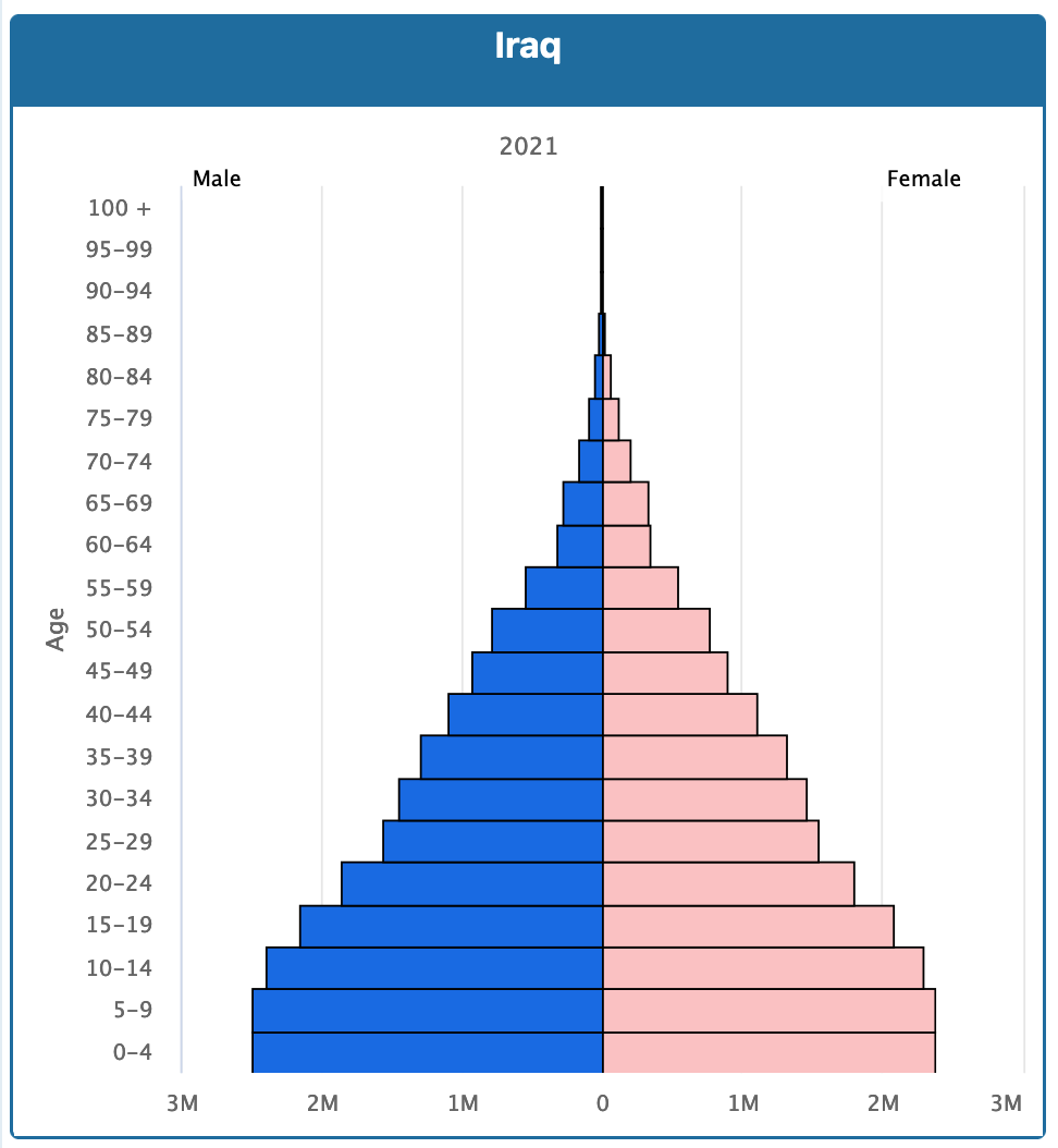
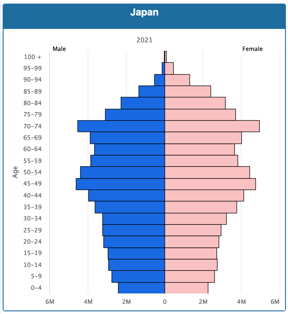
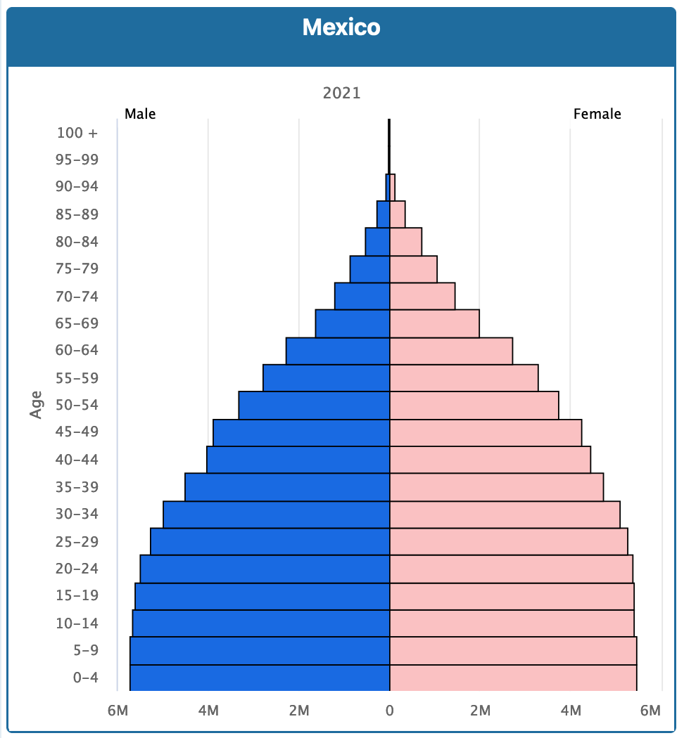
Below are three population pyramids for Iraq, Japan and Mexico
Source: Census.gov, International Program Main Data, International Data Base. Data extracted on 12-12-2021. fhttps://www.census.gov/data-tools/demo/idb/#/pop?menu=popViz&FIPS=IN According to the Demographic Transition Theory, in which stage would you place each of these countries? Why? |
.
As discussed, we can see circumstances such as warfare, baby booms and gender inequality reflected in population pyramids. Similarly, if a society experiences a high level of immigration or emigration, or a severe natural disaster or health crisis, its population pyramid will be shaped by these realities. For instance, the high rate of HIV/AIDS experienced in countries in southern Africa has resulted in a rise in mortality rates.
Figure 8.16: Population Pyramid Projection for Botswana, 2025
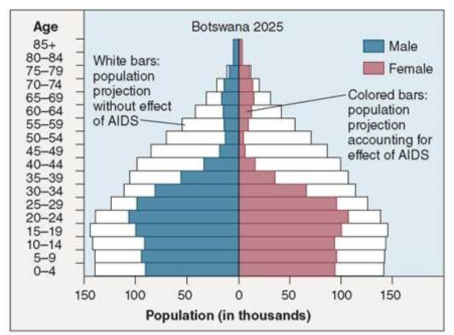
Creative Commons Attribution-Sharealike 3.0 Unported CC BY-SA 3.0 – GNU Free Documentation License (GFDL) – https://schoolbag.info/biology/living/328.html
The blue and pink areas shown in Figure 8.16 “Population Pyramid Projection for Botswana, 2025” above, depict the actual projected population for Botswana accounting for the effect on the mortality rate from HIV/AIDS. The white portion of the population pyramid shows what the projected population size would be without the HIV/AIDS pandemic. With 36% of the population in Botswana living with HIV/AIDS, the devastating impact of this virus is clearly shown in this population pyramid.
Test Yourself
Section 8.5 References
Current world population. (n.d.). Worldometer. Retrieved from https://www.worldometers.info/world-population/.
Ehrlich, P. R. (1969). The population bomb. San Francisco, CA: Sierra Club.
Gapminder Foundation. (2020, April 13). Will Saving Poor Children Lead to Overpopulation? YouTube. Retrieved from https://youtu.be/vGGtxfyC6ow.
Goldstein, J. R., T. Sobotka and A. Jasilioniene. (2009). The end of “lowest-low” fertility? Population & Development Review, 35(4), 663–699. doi:10.1111/j.1728–4457.2009.00304.x.
Haub, C. (2009). Birth rates rising in some low birth-rate countries. Washington, DC: Population Reference Bureau. Retrieved from http://www.prb.org/Articles/2009/fallingbirthrates.aspx.
Kuumba, M. B. (1993). Perpetuating neo-colonialism through population control: South Africa and the United States. Africa Today, 40(3), 79–85.
Malthus, T. R. (1926). First essay on population. London, England: Macmillan. (Original work published 1798).
Population Reference Bureau. (2021). PRB’s 2021 World Population Data Sheet. Population Reference Bureau. Retrieved from https://www.prb.org/wp-content/uploads/2021/08/letter-booklet-2021-world-population.pdf.
Rosenberg, M. (2009). Population growth rates. Retrieved from http://geography.about.com/od/populationgeography/a/populationgrow.htm.
Rosling, H. (n.d.). Global Population Growth, box by box. TED. Retrieved from https://www.ted.com/talks/hans_rosling_global_population_growth_box_by_box?utm_campaign=tedspread&utm_medium=referral&utm_source=tedcomshare.
Shorto, R. (2008, June 2). No babies? The New York Times Magazine. Retrieved from http://www.nytimes.com/ 2008/06/29/magazine/29Birth-t.html?scp=1&sq=&st=nyt.
United Nations. (2019, June 17). Growing at a slower pace, world population is expected to reach 9.7 billion in 2050 and could peak at nearly 11 billion around 2100. UN Desa Department of Economic and Social Affairs. United Nations. Retrieved from https://www.un.org/development/desa/en/news/population/world-population-prospects-2019.html.
U.S. and World Population Clock. (n.d.). United States Census Bureau. Retrieved from https://www.census.gov/popclock/world.
CC licensed content, Shared previously and Adapted
Barr, Scott, Sarah Hoiland, Shailaja Menon, Cathay Matresse, Florencia Silverira and Rebecca Vonderhaar. (n.d.). Introduction to Sociology. Introduction to Sociology | Simple Book Production. Lumen Learning. License: CC BY 4.0. License Terms: Access for free at https://courses.lumenlearning.com/wm-introductiontosociology/.
Conerly, Tonja, Kathleen Holmes, Asha Lal Tamang, Jennifer Hensley, Jennifer L. Trost, Pamela Alcasey, Kate McGonigal, Heather Griffiths, Nathan Keirns, Eric Strayer, Tommy Sadler, Susan Cody-Rydzewski, Gail Scaramuzzo, Sally Vyain, Jeff Bry and Faye Jones. (2021). Introduction to Sociology 3E. OpenStax. Houston, TX. License: CC BY 4.0. License Terms: Access for free at https://openstax.org/books/introduction-sociology-3e/pages/1-introduction.
Griffiths, Heather, Nathan Keirns, Eric Stayer, Susan Cody-Rydzewski, Gail Scaramuzzo, Tommy Sadler, Sally Vyain, Jeff Bry and Faye Jones. (2015). Introduction to Sociology 2E. OpenStax. Houston, TX. License: CC BY 4.0. License Terms: Access for free at https://openstax.org/books/introduction-sociology-2e/pages/1-introduction-to-sociology.
Saylor Foundation. (2015). Social Problems: Continuity and Change. License: CC BY-NC-SA 3.0. License Terms: Access for free at https://saylordotorg.github.io/text_social-problems-continuity-and-change/.
a calculation of population growth that measures the difference between the crude birth rate and the crude death rate
the amount of time it takes for a population to double
a theory by Thomas Malthus on population growth that promotes the idea that population growth increases exponentially and increase in food production occurs arithmetically, resulting in a growing gap between the size of the population and the ability to produce enough food to feed this population, resulting in mass starvation and conflict over increasingly scarce resources
a neo-Malthusian theory that espoused the idea that population growth will outstrip food resources as well as non-renewable resources, prompting the call for reduction in fertility
a theory on population growth that demonstrates trends in birth and death rates over time, showing a correlation between population growth and form of society, and which predicts that with industrialization, population growth naturally slows and eventually declines
policies aimed at encouraging women to have more children
a graphic representation of the age and sex structure of a given society
